Thursday, February 16, 2012

Creating my Travel Topanga map

It was an interesting journey to get to the finished product for the map. Things did not always go as expected, but I adapted and I think that the end project was better because of it.

Step 1: Idea
When I read about the map contest through the regular email updates from Nate and Salli of They Draw and Cook/They Draw and Travel, I thought that this sounded like fun. Plus, while I've submitted recipes to their sites, I still had not done a map. I started with a couple of lists that I thought I would like to work on: cool locations for artists to visit, driving the back roads of LA and Ventura counties, some of my favorite places on Topanga Blvd.

The hubby and I thought that I would have the easiest time and the most fun with the Topanga one, since that is a road we know well and travel frequently. Plus, so many of the locations I liked had a ton of personality all their own.

Step 2: Initial concept and research
What I had in mind was a COMPLETELY different look then the end product. I initially wanted to do watercolor renderings of each of the locations and then combine them in some way with an inked aerial map that I had hand drawn using existing knowledge of the boulevard and looking at (not tracing) Google Maps to confirm cross streets and provide a smidgen of accuracy to the look of the main street and freeway locations.

Later that same day, I went out and painted my first location:

A couple of days later, I painted a second location:

I soon realized that I didn't have enough daylight after work and commuting to get all the paintings done on site. I tried photographing the locations on the weekend so I could paint at home, but that didn't pan out either. I needed an alternate plan.

Step 3: Plan B
My fallback plan was based on a birthday invite I worked on a few weeks earlier, where I hand created all the typography, then colored it digitally.

I pulled out a clean piece of Bristol board and cut it size for the map dimensions needed for a project. Then I used a red pencil to rough out a title and lay in a map at the bottom of the page. Over the course of the next week the map grew as I doodled out typographic signs for the locations I had marked on the map.

Some of the signs pull from elements of the existing logos and signage, others pull in elements of the buildings, and a few just pull in the overall feel I got from the place and are more loosely interpreted.

Step 4: Inking
I started inking in order of heirarchy, starting with the title and map. All the inking was done in a single color, with a Faber Castell Pitt artist pen in Dark Sepia. I used the S (superfine) thickness, except in areas where there are very thickly laid colors, such as the title.


Step 5: Digital
I scanned the inked drawing in two parts, merged them in Photoshop, then brought the entire map into Illustrator. I used three different live traces of the drawing, so I could pick and choose the best option for each element, particularly the very small lettering for the street names. After tweaking a few spacing, sizing, and kerning issues, I colored each element (title, map, shop name) in illustrator using a pre-existing color palette I had, but brought them all into the master Photoshop file separately in order to ensure that I could edit things on the fly if I changed things later (which I did.)

Behind all the illustrated elements, I added individual layers for the solid background color, the strokes of white, and all the secondary colors that appear in the piece, such as the purple frosting on the donut for Blinkie's. Shamefully, all of these were laid in with a very archaic device: the mouse! Yes, a mouse. And yes, the master file has LOTS of layers.

But I'm not done yet...

Step 6: Secret Photoshop MAGIC (...or how I got the cool colors in the title)
I decided to pull the whole piece together with an element of texture, which I always like. I originally was going to use a royalty free stock image to create the texture, but then I didn't want to have to worry about licensing issues since I was submitting this to a contest. So an hour before the entry is due I'm frantically scrambling to find a particular photograph, taken from the hills of Topanga, on a particular day, sometime in the last 5 or so years. Needless to say, no luck.

Then a friend saved the day when she saw one of my paper scraps where i test my watercolors when painting a project. After scanning, I duplicated, rotated, flipped, and cloned until that scrap filled the entire piece.


I applied this texture and a photo of the woods from one of our local hikes to the Photoshop file, tweaking layer styles (overlay, screen, lighten) and opacity for both of the texture elements until I was happy with the result. The darker and lighter brush strokes on the page gave the solid colors in the title added life and character that wasn't present in the original texture I had planned to use.

Saturday, February 11, 2012

They Draw and Travel You-Topia map contest

I have entered a submission into an illustrated map contest:


I had a ton of fun working on and creating the map these past 3 weeks and practically created a new illustration style for myself on the fly! More to come...

Tuesday, January 24, 2012

My first mobile post

For all that I'm tech savvy and married to a tech guy, you'd think that I would have had a blog posting app long before now. Wrong.

But now I will be able to update with works in progress and on-the-go!

The photo is what is currently on my artboard.

Saturday, January 14, 2012

Illustration Friday: Prepare

He was prepared to enter the water, but he was not prepared to meet a new friend!

I had a lot of fun with this one, even in the initial sketch stage. I think that the only thing that would make this illio even better is a yellow duckie tube around the belly. It's tempting, but I'm not sure if I want to possibly mess up the illio for that.

The scanner is down for a couple of days, so I had to photograph it. I will post a scanned version of this once technology is back online...possibly with a duckie tube.

UPDATE: He has an inner-tube!

(still a photograph)

Wednesday, January 11, 2012

Illustration Friday: Grounded


He was grounded until the rains were over, but all he wanted to do is hop.

Just a quick little sketch. I drew the frog over the weekend and he just sat waiting for a story. I was thinking of creating a crowd of frogs, but the rain and lily pad won out.


Wednesday, January 04, 2012

5 years in the making...


I finally completed our collages from our trip to Japan in 2006. It was a fun process, even if it was very start-and-stop.

I used matte medium to decoupage the bits and pieces of the receipts and maps and ticket stubs from our trip, then used colored pencil over the textured acrylic. Once done, I sealed the colored pencil with more matte medium, which caused it to blend together more while remaining transparent enough to see the collage below.

Illustration Friday: Highlight

Differences only highlight the uniqueness of each and every family.

This was a Christmas gift for a friend who loves both penguins and rabbits.

Thursday, December 22, 2011

B3 - Bumble Bee Belly


Just having fun and practicing my new approach to illustrations. I was doing good on the time until I thought he should be fuzzy....and then i undid the fuzzy. oh well. On to the next one.

Tuesday, December 06, 2011

Bully Bot

I'm trying to explore a looser, quicker technique to my illustrations. Here's my first attempt that may or may not turn into a larger project. Expect more robots to come.

This is also doubling as the graphic for my funny new years party invites.

What do you think? Does it need more polish? More color?

Saturday, November 26, 2011

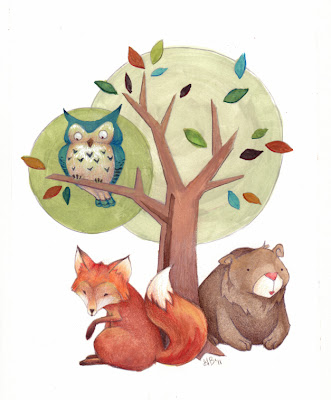
Woodland Nursery gift


My coworker is having a baby soon, so for her baby shower gift, I made her nursery art!

The baby will be a girl and the nursery will have a woodland animals theme, and will include toys from Skip Hop. I had fun trying to put my own spin on a provided theme.


Sunday, November 13, 2011

Black Belt!

Us and our awesome instructors!

6 months without art classes but with many super-intense training sessions and the hubby and I have achieved our black belts! (Although we need to wait for the official certificate.) I'm proud of our accomplishments, but I'm also excited to get back to having more art in my life again. I am going to thoroughly enjoy the upcoming holiday season, and then jump back into art classes after the start of the new year.

In between now and then, I have a couple of personal projects that I've been wanting to work on/finish, so look forward to artwork to come!

Wednesday, August 31, 2011

Hungry Giraffe


Artwork! I had fun with this one, and I tried to push the darks more than I'm normally comfortable. The second image was my initial scan before I went back and reworked the dark areas. I'm much happier with the revised image. And this guy has already found a new home, for a friend's birthday!

And to give me a direct tie in to Illustration Friday, I'll pull in what I told my friend earlier last week when it was still in progress, "He's not finished...he just hasn't been spotted yet!" (i know, bad pun)

Sunday, August 14, 2011

Upcoming testing

Hey everyone! I just wanted to send out a note about the next couple of months. I'm starting to ramp up the training for my black belt test for Tae Kwon Do in early November. Posting will be sporadic for the next 3 months. This is a goal that I've had since I started TKD 12/13 years ago. It got put on hold for a number of years while I finished school, got married, and started a career. I was able to restart training at a great studio and pick up where I previously stopped.

I'm going to try to keep sketching during this time, but I most likely won't have much complete artwork. I will post as I can, hopefully getting in as many Illustration Friday's as possible. Once my test is complete, I will be restarting my art projects and classes in full force.

Saturday, July 16, 2011

Illustration Friday: Gesture


He timidly made a gesture of affection toward her.

So during my photo research at work this week I found such an awesome photo:

istockphoto.com

That trunk, with its curl, was begging to be a caricature of some sort. Out come the pens and markers and voila! Blushing elephant. I love the pink/red marker that I used on his cheeks, but it's scary to use sometimes because it is such a strong color. I did use a gray pencil to draw in the elephant originally, but tried to keep the artwork loose and scribbley.

Saturday, July 09, 2011

Illustration Friday: Stay (Prehistoric Surprise)

This little guy has gone to stay in friend's nursery. Their theme is, unsurprisingly, dinosaurs. He was supposed to be smiling at whoever was in the cave, but he ended up looking more surprised than happy. Our friends were very happy to receive him as a baby shower present.

This may be a loose interpretation of this week's theme, but it is a rare occurrence for me to post finished, full-colored art.

I originally planned to crop this much tighter, but when I was at the frame store, I ended up liking the look of the panoramic matte rather than the standard 8.5x11. Luckily, I gave myself plenty of bleed area to try out different framing options.

I feel I've sufficiently mastered the dark-medium-light variant of basic composition. Next composition must be different, so I can study all 6 basic variations of foreground-middle ground-background lighting arrangements.

Thursday, July 07, 2011

Happy Birthday Bella


Happy birthday to a most wonderful niece and Goddaughter! You are growing up too quickly!

Friday, July 01, 2011

Illustration Friday: Remedy


"Choose your remedy wisely."

There actually is a story behind this one: At dinner, while trying to figure out what to draw for illustration friday, we had some almonds on the table for our salad and the package read "all natural!" Well, the hubby wanted someone to make a product that markets how UN-natural it is. So I did. For more amusement, it was suggested that the side of the label read "mild side effects include death..."

It may be darker then my usual doodles, but I guess I had a bit of quirky humor going on today. Now that I think about it, "humor" would have been a good term to add to the bottles, especially when I was running out of label ideas. It was a lot of fun to lay in the shades of gray with the markers, and I got to put my toe into the steampunk craze that is quite fun.

Tuesday, June 28, 2011

Happy Trees


So not all my sketches turn out exactly how I want them too. This one was supposed to be much more regular, almost pixelated placement of trees. I almost gave up on it a number of times, but I kept at it. It's growing on me.

Sunday, June 26, 2011

Illustration Friday: Midsummer Night


It started with a continuous outline of their silhouettes, some heads added Tom Gauld-style, then the wings...and a perfect opportunity for me to draw some patterns, since I've been seeing interesting patterns everywhere recently. A little bit of crosshatching for texture, a lot of blocking in solids and a touch of typography. It was very interesting to see how the natural variations with the line work of the silhouettes created a range of unique characters, including a few matrons, a few innocents, one that may be pregnant, and Titania, who happens to be the tallest of them all.