Saturday, February 21, 2009

Daily Sketch 22: male, 9-10

Original Image. (will be posted as soon as I find it again)

Analysis: I got a new toy...a touch-screen laptop with drawing pen. I decided to try my daily sketch digitally. There is some disconnect between the pen tip and the screen. Also, I either drew too small, or have the image at too low resolution (it was set at 150 dpi). I'm also having issues with the angle of the pen; if it is angled too much, it doesn't register on the screen. I'll need to practice more.

Friday, February 20, 2009

Illustration Friday: instinct


"while the hunter used every instinct to take that mouse, the mouse had his own instinct..."

It's hard to see, because the sketch is so small, but the mouse with the cape is a stuffed mouse, not a real one.

update: I accidentally put colored pencil as the description on Illustration Friday, so I felt obligated to color it.

Wednesday, February 18, 2009

Daily Sketch 21: Male, 7-8 years

Original Image.

Analysis: I did the sketch today, then I reanalyzed the jaw line, since that's where I'm making the biggest mistakes. I then tweaked the jaw line a bit until I was happier with it. I'm still not pleased with the left eye/side of face and right ear. The eyes are too close, and a bit too big. I'm pleased with the hair and the nose.

I tried a little digital tweak to the eyes, and just a slight shift and slight resize helped a LOT.

Tuesday, February 17, 2009

Daily Sketch 20: male, 5-6 years

Original Image.
The story behind this photograph is a heart wrenching one.

Analysis: This is the first actually-15-minute sketch I have done in a long time. Also, I really roughed everything in quickly, without much careful measuring. Still, for the unique angle to the face, I feel I did a pretty good job. If anything, I'd work more on the neck/jaw line, since that is the most awkward area. Also, I really liked the shape of the lips and did not do them justice in the time allotted. I was happy that I at least roughed in the shape of the brother.

Monday, February 16, 2009

Daily Sketch 19: male, 3-4 years

Original Image.

Analysis: I succeeded in getting an emotion...I just don't think I drew the correct one. He looks angry rather then unhappy. I'm also not quite sure how to draw the 'laugh lines' that run from the nose to the mouth on children, since strong lines usually denote wrinkles/older age. Need more practice at subtle expression shifts.

Saturday, February 14, 2009

Illustration Friday: celebrate


Ok, so technically my illustration friday was done on a saturday. Oh well. I still plan on posting a Saturday daily sketch. It took a while to get the limbs where i wanted them and looking natural. Overall, pretty happy with this sketch.

The story behind this sketch is from our Friday the 13th fun at work. They posted pictures of good luck charms all over the building and at different times they'd email out an image and you had to go find that image to win a prize. I found one of the four-leaf clovers and won a large pink bouncy ball. Silly, but fun. :)

Thursday, February 12, 2009

Daily Sketch 18: male, 1-2 years

Original Image.

Analysis: Drawing someone is worse if you know them. Plain and simple. Then it is not about quick sketch or drawing what you see. It becomes more about does it really look like them, or in this case: is the sketch cute enough because the kid sure is. Philip and Jenny, your kid is MUCH cuter. :) It's his lips...extremely cute AND distinctive, but a pain to draw and have look right. Also, I got the angle to the eyes and mouth, but missed it slightly with the nose.


The part of my daily sketch that people normally don't get to see is the drawing overlaying the picture. I don't post it because of copyright issues, since I am drawing faces from off the web. I did pretty good with proportions of the face, except for the jaw line. Gavin has chubby cheeks. One day I'll be better at the proportions, after a couple years of daily sketches :)

Wednesday, February 04, 2009

Sketches

Technically, I did a daily sketch last night. However, it is not being posted because both Eric and I concur that the sketch of the cute little baby ended up creeeeeeepy. Why can't I draw cute babies. I like babies, I like cute things. I don't understand it.

Also, the daily sketches will be on a pre-scheduled one-week hiatus and will return next week...hopefully with cute drawings and not creepy ones.

Sunday, February 01, 2009

Daily sketch 18: male, newborn


Original image.

Analysis: This month I begin the first of a 2-month long theme: The human form at every age. This month I am working on drawing males, starting with this newborn. He's just so cute all bundled up in the towel basket--not that you can see the basket in the sketch. I did borrow a technique from the Tatty Teddy to make the towels look all fuzzy without any shading.

Temporary web gallery up

Web Gallery.

Since my blog is my website at the moment, we decided that I needed to get my gallery up. It's good to get my work out into the world. Maybe it will encourage me to work faster. :)

Enjoy

Friday, January 30, 2009

Illustration Friday: flawed

Illustration Friday.

Theme: Flawed. This is actually my second sketch today...wasn't liking the first one. These were originally going to be plant creatures, one with a missing petal, but they ended up armless-bird/cat/Dr. Suessian creatures of an unknown and slightly confused sort. One has a slight problem...

I've been wanting to do an illustration friday for a while and keep forgetting. I remembered today! yay! Hopefully more to come.

Tuesday, January 27, 2009

Daily Sketch 17: Hands? ...nope, paws


Original Image.

Analysis: The theme was paws today...I just chose an image that had a bit MORE than paws in it. I like the motion/movement to the sketch and the original image. I had fun with the sketch, and working with interesting shapes (sometimes, i feel like i'm drawing the same face again and again with portraits). I didn't like how the cub's face came out, and i think i messed up with the eyes. I love how the mother's face turned out, even with a crooked nose. We'll also ignore that my vertical line denoting the edge of the picture is anything but vertical.

Sunday, January 25, 2009

Daily Sketch 16: Hands on table


Original Image.

Analysis: Hands still suck. I actually don't think I did horrible, except for the fingers (not thumb) of the back hand. They are too small. Because the hands are so complex to draw, shading is minimal. I hope as i get better I learn to shade more in 15 minutes.

Friday, January 23, 2009

Daily Sketch 15: Woman w/ hat II

Original Image.

Analysis: I loved the shadow shapes in this photo, and it's the first one where the majority of the face is dark. VERY dark. The eyes are slightly off, the upper left side of the face needs to be darker, and the lips and face slightly wider. The lips look fuller then I actually drew them, but that was a result of when I was laying in the shading. The fun part is that I did use my electric eraser when i was done to pick out the highlights in the white of the eye and the chin strap.

Wednesday, January 21, 2009

Daily Sketch 14: Looped fingers

Original image.

Analysis: A friend informed me that I was being lax in drawing hands, so thus we have hands! Perspective on fingers sucks. Plain and simple. I did a decent job on the last three digits of each hand, but lets not get started on the thumbs and forefingers. Bad perspective, bad scale (itty-bitty thumb, large forefinger). Overall, I like the linework in this sketch more then the actual drawing. More hands needed.

Monday, January 19, 2009

Daily Sketch 13: Woman looking up

Original image.

Analysis: I think I know where I'm going wrong; I think I draw the lips way too small for the shape they actually are. I drew out my nice framework with a solid parallelogram from the cheek bones to the chin with just a slight curve at the bottom, and still, the eyes ended up in the middle of the cheek bone line rather than above, as they were supposed to be. Thus her face is shorter and fatter then it is supposed to be. Even still, I redrew the nose 3 times and the eyes 2.5 times and overworked the neckline. I know where the shading is supposed to go once the features are in place...i just need to properly size/align everything now. No wonder some people can spend a lifetime learning to draw the human form.

Sunday, January 18, 2009

Daily Sketch 12: Mustache

Original Image.

The original theme for today was Conquistador, but all the images i could find were drawn or painted, so I went with what any good conquistador would have: a mighty fine mustache.

What's cooler than a guy with a black bowtie, black bowler hat, and a 6-part curly mustache?

Analysis: Obviously I had fun with this more-like-30-minute 15 minute sketch. For some reason each time I become fixated on working on the nose first, and I think I start working to fast, leaving me no room to correct. I think this nose should have been wider and maybe a smidgen shorter. And for some reason glasses always hang me up on the shading of the face. I didn't quite get in the laugh lines as well as I wanted.

Saturday, January 17, 2009

Daily Sketch 11: Yawn

Original Image.

Analysis: This sketch was a lot of fun. I think I really spent 30-40 minutes on this 15 minute sketch, because I wanted just a little bit more detail. The wrinkles on the nose and eye lids are so delicate to draw/shade, I needed to work with them a bit more to feel satisfied. His nose looks just slightly angled to the left, and the cheeks are a little thin compared to the size of his facial features, but that would be an easy fix. My favorite part is the brow line and forehead on the left. I'd like to get that level of spontaneity and rendering/shading throughout my entire sketch at some point. Sometimes I overwork things too much.

Thursday, January 15, 2009

Daily Sketch??


This is a test of the gotta-work-on-something else broadcast system. Your regularly scheduled daily sketch will return tomorrow. Please tune in then. (we apologize for the inconvenience)

Oh, and if you magically know how to turn fire and water into palm trees, please give me a call! (confused? so am i.)

Wednesday, January 14, 2009

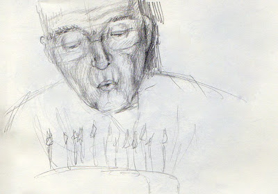
Daily Sketch 10: Blowing out candles

Original Image.

Analysis: This posed an unusual challenge, in that the main source of light is technically from below from the candles, but because of the camera flash, there's a double light source. This resulted in some of the areas that I expected to be dark (upper lids) actually being fairly light. Given more time, and an eraser, I could work on refining the light source. The candles and cake were thrown on the page after the timer was up for reference (he looked strange without it). Right eye is too small, lips are too small, shading where the glasses were is off, because I could mostly just see the reflections of the candles in the glasses. Fairly happy with the initial shading on his jowls, even if they may be a little skinny.

Tuesday, January 13, 2009

Daily Sketch 9: Woman with hat (hair accessory)

Original Image.

Analysis: Lips too far to the left. Maybe if this were fixed, she would look more like she was smiling instead of looking confused. Also, the lines on her face are not as harsh as the sketch shows. I think I need to try hatching in the lines, rather than being so linear with them.

Monday, January 12, 2009

Daily Sketch 8: Grimace

Original Image.

Analysis: This is NOT a 15 minute sketch...more like a 45 minute sketch. Overall, the face is at least twice the size of all the other faces, so more area to shade. I don't like the pout, and I did a really bad job on the eyes. They're not even close to the same size. I always seem to have more trouble with the half closed eyes, because they're deceptively long. I am really happy with the shading on the neck, because it lays in a solid area of grays that somehow has its own unintentional shading, and it was really fast. It also quickly distinguises between areas of light and shadow. I need to do this more initially before getting to form-following shading.

Sunday, January 11, 2009

Daily Sketch 7: Astonished

Original Image.

Analysis: I think my biggest complaint is the nose. The perspective is not as good as I would like. It's a delicate nose, angled up and the only truly dark areas are the nostrils, which both angle up and slightly left. The nose I drew is shown too much from the front. I think her features are also a bit small for the size of the face I drew. I didn't really lay out all the angles that the facial features lay on, and I should have. Also she's supposed to be looking up rather than slightly to the side.

Friday, January 09, 2009

Daily Sketch 6: Baby kissing mirror

Original Image.

Analysis: There were two slight shifts in my sketching technique today that I'm going to try to incorporate in all further sketches. First, I noticed I'd been using a lot of short, stiff strokes to lay out the basic form. Second, I was randomly laying in shading all over the form, resulting in minimal shading over a large area. After watching a video of another illustrator sketching using very fluid, quick, loose strokes to lay in the form, he then went back and shaded only the focal point, leaving the rest of the sketch very loose. Over all, I think that is the best option for me. The loose, let-the-pencil-flow from the center out is something I learned in drawing class and I'm already pretty good at doing...if the subject is a child, like the one here. Children are all round with dynamic poses and I like their proportions better then adults. I think this sketch was fairly successful, although it looks more like she's kissing an older sibling with a flat nose then her own reflection. Also if you tilt my image slightly to the left (or your head to the right) the position of the head relative to the body is more accurate.

Thursday, January 08, 2009

Daily Sketch 5: Hand holding flower

Original Image.

Analysis: As my first hand, I picked a fairly difficult one. It has a LOT of character but it is a relatively flat palm; not the most dynamic of hand shapes. Even still, I should have flowed the pencil across the page more, feeling out the overall shape and rhythm. I particularly like the graceful curve of the palm/first finger and the v it makes with the thumb. I erased and redrew the fingers just like I erased and redrew last night. I don't know if that made it better or worse. My proportions are a little wonky and the image is stiff. Need more practice.

Wednesday, January 07, 2009

Daily Sketch 4: Asian Profile

Original Image.

Analysis: Just. Plain. Bad.

So much so, in fact, that I chose to repeat the exercise and try again. The first image was going well until I thought that the chin was too long. Instead of doing the intelligent thing and fixing the chin, I chose to erase the completely drawn out ear and push the ear back. Wrong idea. After doing so, I had no drawn ear, no more neck, and the chin was STILL too long for the face. Overall, the face was too flat.

Attempt 2: Much better, even if I never did get to draw any hair. She actually looks like a decent looking human now rather than a badly proportioned alien masquerading as a human. I think the corner of the lips should be further left, and I only got to lay in rough shading. I will have to draw more asian faces. They have such subtle shapes that it really is a lot about shading (once you lay in the correct form, of course)

Tuesday, January 06, 2009

Daily Sketch 3: Man in hat

Original image.

Analysis: This guy was a fun face to draw, he had character. I got to shade some today, and I actually got a little bit of the beard in this time! I think it's because his face is not my 'standard shaped face' that I always end up drawing without a photo reference. I think my drawing of him is also happier than the original image. Areas that need work: right side of face...the cheek is too concave, and the jaw juts out slightly to the right. Also the shading under the chin was laid in to harshly at first and I couldn't refine as well as I would have liked to. Need to get all the cast shadows darker, but particularly the ones under the brim of the hat, since that is practically the focal point of the image. Another random thing is that i don't like the shading on the background...should have shaded it out more or let it fade on the outer edge.

Monday, January 05, 2009

Daily Sketch 2: Glasses


Original image.


Analysis:

Spent more time working on the tangents today...so much so that I didn't even start shading! Really, i started being too picky with the shape of the mouth and the nose (and yet the mouth still needs to shift right more. I also think that i'm making the edge 'curves' too deep, they're very soft and subtle in the picture. The eyes are also a bit off. I didn't fully get the sassy glance down, either. Did have fun with the messy hair, though.

The purple coloring was done after the timer to just lay in the hand briefly, and make adjustments I felt were needed.

Sunday, January 04, 2009

Man with big nose

Original image.

Analysis:
Not bad for my first sketch. I need a sharper pencil (or to have my pencil sharpener handy. Totally missed the mustache, and the whole mouth/jaw area needs more detailing/wrinkles. He looks like he got a face lift in my sketch. Ear is too small, too high, and too close to other facial features. I need to work on placement of features by adding my tangents in more before I start shading. Overall, pretty happy with the nose and eye although the bridge should be slightly wider.

New Year's Resolution

Even though it is not New Year's eve/day, there's still time to make a resolution. I've been thinking about it and I decided that I wasn't going to make a whole list of fancy resolutions that would attempt for a few days/weeks and then the resolution dribbles away into nothing.

I only have one true resolution that I would really like to do: work on more artwork. I've seen many cases of an ok artist developing amazing drawing skills just by constantly drawing. Case in point: Megatokyo. Look at the artwork of Fred Gallagher's first volume and look at his skill now. Even he admits he wasn't the greatist at figure drawing when he started. With my own art, I have definitely seen a marked change in my skill level when I started college to what I work on today. However with my full-time job as a graphic designer, I have let my skills dribble down to the occasional illustration (maybe one every 3-4 months) and I rarely sketch anymore. And sketching is where you come up with some of the best ideas sometimes. Also, I continually laud the fact that I can't draw hands and faces as well as I should.

That being said, my resolution is to spend 15 minutes (timed) a day on a random sketch of hands or faces and post each sketch to my blog. To encourage that I stick with the project, if I fail to post for 3 days in a row (except in times when we're traveling for vacation) we will cancel our cable. So look forward to the sketches, and I will be looking forward to seeing the progression of my skill over a year's time.

Saturday, April 26, 2008

Me sketching...me


Hey look! Wasn't I a cute kid?! I've been looking for free sources of reference photos for my illustration work, ie., photos that myself, my family or my friend took and don't mind if I use for reference, and I thought what better to use then photos of myself. I've always liked this image of me climbing the fence, and I had fun drawing it freehand, particularly with the fence.

Sketched in a moleskin, the one sketchbook I seem to adore, especially the purse-sized version.

Second vector illustration


This is my second trial illustration using Illustrator. The reference photo is of my niece, Bella, although I primarily used her face/upper shoulders for the reference. Oh, and the outfit, because she always has really cute outfits on. The only thing I'm not fully happy with is the kneecap, but since this is digital, and I work on layers, this is infinitely editable and I can fiddle and fuss till my perfectionist heart is content. Yay me :) If I wanted to be particular, her eyes have no color and her hair has no shading, but I still like it a lot, as is.

I did this for a sample for a possible illustration job that I'm hoping to get. More news on that if I get the job.

Belated finished sketch...


It's been over 2 weeks since I finished the quick little samples of the young girl sketch that I posted last time. I should have posted them long since, but here they are now. I did a total of 4 in one night, which is quite different then my usual pace. 3 were traditional ink and watercolor (with a little color pencil thrown in) and the one with the solid green background is digital using illustrator (vector illustration, woohoo!). My favorite freehand one didn't get saved correctly, and I am not going to scan it again now. I am not 100% satisfied with the dress folds where her leg is coming forward. I liked the folds in the sketch better, but you could also SEE her legs in the sketch. I want to start taking drawing classes again, particularly classes that focus on a) heads, hands, and feet; b) fabric folds and drapery; and c) animation classes that focus on expression. I think that will help my illustrations out a lot in the long run.

Tuesday, March 25, 2008

Sketch in progress...


I'm working on samples of my illustrations using both traditional and digital media. I will be working on the same set of illustrations in both media. Tonight I worked on the digital version of one of my sketches from last year that I really like. This is the illustrator traced version of the image. I will be trying out both blocking in color with illustrator and using photoshop to "brush" in color behind the "ink" lines. I will also be using both a pen and a quill in my traditional ink and watercolor samples.

Thursday, March 06, 2008

Achoo! complete

Tonight was a very productive night, as I finished the last little bit on my illustration for the CSUN illustration club student show Affliction, which opens tomorrow night. It is called Achoo! and it is very cute. I did it in a very rough format, working rapidly (for me, if not for the rest of the art world). I don't like the blending quite as much as the other pieces, but I really like the color and contrast in this piece: very rich, vivid color (for all it being a muted palette) and better contrast than my work normally has. I will consider doing more pieces like this as I finish in about 1/3 the time. But I will not make any decisions without trying more techniques out on my demo board. Even then i'll probably continue to experiment and grow and develop even newer techniques. Hopefully by that stage i'll have also purchased a Cintiq and Painter and will be working on digital art as well as traditional.

In addition to finishing up an illustration, I have done a quick sketch/color comp of the next piece I'm working on: a knight charging a monster, as seen from the knight's viewpoint. I think the end piece will be wider then what I sketched out, and I'm not so fond of the monster at the moment, since i am not very good at scary looking monsters (CUTE monsters, no problem) but I like it so far. I think it is more dynamic then what I usually do, and I can even push the final drawing a bit more then what I have so far.

All in all, the only disappointing news I have tonight is that I won't get an image of Achoo! on the website until a week from now when the show comes down and (hopefully) my scanner is installed on my computer once again.

Monday, January 28, 2008

Post or else...

I apparently HAVE to post, because I haven't posted in nearly a year. I guess time flies when you're busy....A new job, a NEW new job...a new nephew when we were expecting a new niece...I guess life happens. :)

Two new pieces of art currently ongoing...a dragon for Jan, almost done...if I can ever figure out what to put behind him. And a CUTE (really serious here) entry for the disease/sickness/affliction themed illustration gallery show at CSUN in March. When Scott saw it and I told him the story behind it, all he had to say was I was "...seriously well adjusted..." You'll get the full story when I post the art. And one day, Scott WILL actually get artwork created for him by me...sorry Scott, I must be too well adjusted for the first 5 or so tries on your artwork.

I'll post more later when it's not past my bedtime.

Thursday, January 24, 2008

Site temporarily down

This is Deathshade posting for Nightengail, I took our home web server down to repurpose the hardware. I'll try to bring her site up again soon.

Wednesday, August 15, 2007

Yay! Four new images on the website

There are now 4 new images on the website: 3 colored pencil illustrations and one watercolor piece. The watercolor piece is one from last year that finally got scanned. I found someone in Glendale who does large-format scanning with about what I expected for prices. (I would always like less expensive, but it is still decent pricing)

The first colored pencil illustration is my namesake and one of my oldest acceptable drawings redone in my new style. It is a mechanical nightingale based on the oriental fairy tale "The Nightingale." I really didn't like any of the other illustrations I did for that project, but I always loved the mechanical bird. I decided to wait until my skill level caught up with what I wanted the bird to look like. I might work on one of the more dynamic poses I had for the bird at a later date, but for now I'm pleased with the one that I did.

The last two drawings are for an online baby store that will be opening up soon: www.notyouraveragebabyshop.com. I had a lot of fun working on these illustrations, and working with the owner of the online store. The site is not live yet, but there is a nice placeholder page with a vaguely familiar image on it.... :)

I have a number of sketches that i'll be turning into illustrations at some later date, but I have two projects that I plan on working on next...I better get to them!


Powered by ScribeFire.

Monday, June 18, 2007

Workspace


Although I do have an art desk (and a computer desk, I have taken to working on my current illustration in the guest/computer room. Around me are all the necessities of a good colored pencil illustrator: my trays of colored pencils, and all the pencils I've been using (the ones that are on the bed, and not in the cases) an electric eraser, and refill erasers, pencil sharpener, an iPod with an audiobook (currently Flyte by Angie Sage), a back pillow, and of course (most importantly) jelly beans for a snack!

Saturday, June 09, 2007

When good stuffed animals get schnockered


This is what happens when your stuck on a sketch revision. You start drawing very inappropriate, but none-the-less amusing, images. I think i'll work on the other illustration for a bit and then come back to this one. Ok, not THIS one specifically, but the actual revisions I'm supposed to be making. I think the drawing of the animals may be about an inch or so high, at the most.

Saturday, June 02, 2007

So this is what the workforce feels like....

Where does all my time go these days?! It feels like it has been ages since I've posted an update on the blog. And it has. The last blog I remember posting is a reflective commentary on post graduation/entering the working world. Oh, for the freedom of school and surfing the net at every available instance. (yes, I LIKE school....if i could get rid of finals, I'd LOVE school!) But I guess we all have to grow up some time. (but i don't want to...)

I'm slowly learning to find a balance between fun and illustration in my off hours. My newest favorite thing is the Secret World Chronicle, a pod cast created in part by one of my favorite authors of all time: Mercedes Lackey. heh...I just happened to look on the website again while linking to it and I noticed a little blurb at the bottom right side of the header: "Illustration by Larry Dixon." For those who aren't familiar with Mercedes Lackey and Larry Dixon, they're married. It helps to be married to the illustrator of your project.

...a little of topic, but that's ok. Anyway, my newest favorite thing is the podcast, because I can listen to a wonderfully written story and draw at the same time. All the fun things i want to do together!

I have one small illustration job that's in the works. I'm not divulging much, other than it's going to be the identity for an online store! So far the project has been a lot of fun and right up my alley with the cuteness factor.. I think me and my client are both experts at writing novel length emails! She's fun to chat with and has lots of good ideas. Other than that, I have illustrations for friends and family that are LONG overdue.

Friday, March 30, 2007

Babies R Us

I've been overwhelmed by babies recently. Every where I turn there are babies. Maybe not literally, but it sure feels that way. With Bella, and another baby Buschman (the OTHER Buschmans, that is) that is on the way our immediate family is starting to develop their next generation. Two of my other cousins just had little girls, my boss just had a little boy, and one of our closest friends is going to have a baby boy in May. I have 5 gifts for babies/children sitting behind me at the moment, waiting to be delivered to their recipients.

I've been asked, particularly by Jessica, when is it going to be my turn. Unless by accident, not any time soon. As much as I love babies, I really enjoy the lifestyle that my husband and I have. I'm sure people look in askance when we go out to dinner and sit there reading the whole time, and not saying one word to each other, but we are both extremely happy to be doing that. I also REALLY like not having stinky diapers and spit up to deal with. Furthermore, I don't need a baby to mess up my house. I am quite capable of that, thank you.

I know I'm sounding like a baby is all negative things, and I am aware of what a joy a baby can be. I personally like being the Auntie and spoiling them, and having fun with them, then sending them home to mom. All the perks, none of the negatives. I think I'll let DeAnna have the third Walton grandchild. At this time, all I'm looking for is a happy medium of work, illustration, games and books, but for now, 3 out of 4 isn't bad.

Tuesday, March 27, 2007

My thoughts on design

I've been working at PrintFellas for approximately a month now and I've been enjoying it a lot. I've been expanding my knowledge base in computer graphics, learning many tricks of the trade and time-saving techniques. I still feel slow, but I think I'm getting faster. Well...except when I'm trying out new tutorials at home. Then I'll follow the steps provided and try out 10 other things to see what would happen if I changed something. I've been learning more and more that layers are my friend and there's never such thing as too many layers.

Would I have learned more than what I left school with if I had focused solely on graphic design instead of graphic design and illustration? Undoubtedly, but illustration has been an ongoing pleasure (albeit a sometimes pain as well) that I wouldn't trade for anything. Also, I am not dependent on the computer alone to create my artwork. I love working on my colored pencil illustrations, even if I don't get as much time to work on them these days then when I was in school.

Should I have learned the majority of the things that I'm learning now while I was in school? Probably. One can argue that there are so many facets in trying to teach someone graphic design that teachers are required to pick and choose what to pass on to students in a 14-16 week period. First, training someone to have an eye/skill for good design, including what makes design good or bad. Second, typography and learning how to use it effectively to hone your design/message. Third, color and color theory: what meanings the correct hue, shade and tint/tone a color can bring to your design; anyone who says there's no more than 10 shades of blue (or any other color) has never designed before. Fourth, learning the medium that your designing: if it is web, understanding how RGB and web pages work/function; if it is print, then understanding how cmyk, printing processes, and types of paper interact with each other to create the finished product; if it's packaging, then understanding everything for print as well as how things are assembled three-dimensionally; if it's environmental graphics, then having an understanding of ALL three of the prior processes, since it is likely they all will be used on a job.

There is a fifth area of training that teachers must teach their students, the one that started this rant/postulation initially: teaching the students how to USE the design programs. The main problem with teaching the design programs is that there are students at every level of education when they start schooling, and unfortunately teachers have to go at the speed of the slowest student. In the lower level classes, the teachers must assume that you've never worked with the programs before. This frustrates students like me, familiar with the computer and with most of the basic workings of the program. To further compound the issue, the initial computer training classes are often taught by grad students and then the students learning are confined to the knowledge of the grad students, which may be limited. Granted, upper level classes, such as packaging design, expect you to have a working knowledge of all the programs necessary to complete your assignments, but students can make it to those classes without having learned the necessary skills. I went through half of my graphic design classes without learning something new from the teacher. Mind you, I only had 6, but I still took more graphic design classes then the MINIMUM needed to graduate with an emphasis in graphic design.

I don't have an answer to the problem of how to teach graphic design efficiently, but I will mention my most useful class. I took Magdy Rizk's Graphic Design Production class, and he spent at least half of all the classes on lectures, including technique/process demonstrations, showing samples of good design and what to look for, and showing us the printing processes and teaching about paper, ink, etc. He even took us to a printer to see the printing process in action. That class is the one I learned the most from in all my graphic design classes at CSUN.

Monday, February 19, 2007

New website up and running!

Welcome to v0.7 of the new Nightengailart.com. The layout I kept simple and clean for a starter website, but I have ideas in the works to integrate my illustration and the website layout. The links page should be operational soon, and the home page might change a bit, but we're pleased with the website so far.

Please let me know what you think, and if there are any glitches or suggestions, tell me.

Thursday, February 15, 2007

Interviews and more

I've been sending out resumes like crazy and working on my website, in hopes of getting it up and running. Been going on a few interviews and have a few more scheduled for this week and next.

The new website is coming along well. At this point we're making minor changes to the appearance, and tweaking details. Version 0.1 should be up and running within two weeks, but hopefully sooner.

This weekend I have my niece's baptism to attend. I am one of her two godmothers, and am very happy to be one. I'm looking forward to playing with her and spending time with my sister.

Wednesday, January 31, 2007

I am sick...blah

Everyone's been getting sick except me, and I was happy that all I had was a sore throat and stuffy nose. But yesterday I managed to get more than that and now I'm not happy...this is when I wish I had a working bathtub.

Tuesday, January 09, 2007

Portfolio rework


Today I started really reworking my portfolio, and I got 9 pages in it done. I still have 2 major projects that I need to fix up and then a few additional projects that I'm going to start from scratch and create to add to my portfolio. I've been printing and reprinting pages to make sure they're up to my standards of acceptability. The image I'm posting is one of the best pages in my portfolio (according to Eric) because I've made the layout look all three-dimensional. I've also been using many tutorials and guide books to learn more and more tricks and techniques to the programs I've been using to get the most out of them.

Monday, January 08, 2007

Postcards Finito!


After good feedback from my illustration group today, I have finished the final version of the first postcard mailers. Although only one front illustration is show, I have designed fronts for all the colored pencil illustrations I've done so far. I won't order them all at once, but space them out in hopes of attracting attention to my artwork. Now as far as illustration stuff goes, I need to do a quick redesign of my website (just so my artwork could be on the main page) and update my portfolio. But before that, more graphic design in preparation for my interview on Wednesday.

Saturday, January 06, 2007

Friday work

I think i'm fairly happy with my design I came up with on friday for my postcards. I used the layout that I've been using for my illustration portfolio, which I enjoy the look of. This will keep all my work cohesive looking until I work with my friend Stephanie on redesigning our logo/stationary package. I didn't get a chance to post last night as I was working on installing Photoshop CS3 Beta (thank you Eric!) and also cleaning up my files, since I had at one point less then 1 GB space on an 80 GB harddrive. Today, I'm at Connie's house, so the updates are probably going to be only text until I get back home.

I'm going to Carol's house for the monthly illustration meeting on Monday, and I'll be bringing samples of my postcards to get feedback from everyone there before it goes to print.

Thursday, January 04, 2007

Postcard A


Postcard B


Postcard C


Here are three options for my illustration mailer postcards. Three fronts are given, and three backs. Let me know which ones you're liking more, the first of each being A, the second B, and the third C. Two things to note about these postcards: 1. They are NOT done. as a work in progress, there are some good things happening, and some crap still remains. 2. The text design at this point remains simple to match the font I've chosen for my portfolio/resume. I am supposed to be teaming up with my friend, and we're going to design each others stationary packages, so until then, I just keep it simple.

Errand day

Today I drove all over the valley running errands. The good things that came from these errands: more copies of the illustrated holiday card I did, and I filed the paperwork for my DBA. The announcement will be published in a little valley paper called Warner Center News, and I can now put NightenGail Art on my postcards, business cards and mailers. yay! Hopefully I can get some work on those postcards done tonight so I can have a visual to post as well tonight. But until then, this will do.

Wednesday, January 03, 2007

Alphabet


Today besides more diet prep-work I finished all but one of the letters and about half of the titles for the workbook. I didn't finish letter "R" (or for that matter, X and Z, but I don't think they'll be used). The post is kind of late tonight, but we also slept in late (until 10:30) so I didn't get a full work day during the day.

I also have an interview set up for next Wednesday! It's not for a full-time position, but for possible freelance graphic design jobs. Anything that will be work for me will be nice. I'm sure I'll be more nervous next week, but I'm just kind of excited about it now.

Tuesday, January 02, 2007

Resumes and Letters


Today was good and bad. I didn't get the outlined letters for the layout I'm working on totally done. What is posted is the start of the lettering. I drew my own alphabet freehand, and I'm now tracing it on the computer so I can make all the titles for the children's workbook. I did, however, update my resume, prep all the food for the week for the new diet, and start work on updating my portfolio for graphic design. I also sent out two resumes for potential job opportunities for graphic design.

For those providing me feedback, i'm emailing my resume for review.

New Years Resolutions

I have created two New Years Resolutions for 2007. One pertains to my personal life, one pertains to my artwork/career.

The first is to follow a budget we established a couple of months ago. While I was in school, we didn't follow the budget very well, opting for convenience and time savers over money savers. Now we HAVE to follow the budget (and the fact that we're also going to follow the South Beach Diet for Eric will probably help, since we have certain foods we shouldn't be buying.)

The second is posting every day to this blog showing something I've worked on for art/career. It doesn't have to be a finished piece by any means, but any progress is good for me. This will also help me get feedback I would normally get in a classroom setting, especially when I'm stuck on a project and don't know what to do. A new perspective is always useful.

Friday, December 29, 2006

Test

This is a test using my performencing editor to write my blog. So far, what i don't like is the erasing feature. If you misspell, it's annoying to correct it. But i'll give it a try  for a bit.


powered by performancing firefox

Thursday, November 16, 2006

Busy but happy

I've noticed over they past couple of years that I LIKE being busy. I can easily STAY busy once my semester is over, since I already have enough projects in mind to keep my time filled for at least a few months. The other problem I find is that I like interacting with people and working on my art in conjunction with other people working on their artwork.

The problems in my observations is that I have adopted the viewpoint of the home as a haven. This viewpoint evolved in America as it grew out of the rural, agrarian lifestyle and into a more industrial life. In the agrarian lifestyle, a person's home and a person's work coincided: the home was the central workplace, and often a family would work together. As men began leaving the home to go to work, the home began being viewed as a haven and a place for rest and relaxation, rather than work.

With the numerous books, movies, and games around my home--not to mention the internet in and of itself--the home is a place of fun and distraction. I also manage somehow in that space to forget everything I've been training for in illustration regarding using references and sources of inspiration and then I stare at the blank page and shake my head in frustration and aggrivation when I can't think of what to draw or why my drawing isn't turning out right.

I like it best when I'm in school and I can spend all day AT school, away from home and those distractions, and then go home at the end of the day, relax for a bit, perhaps get some more art done, relax some more and go to sleep. This bodes well for my work ethic, but unfortunately poorly for my future if I were ONLY persuing freelance illustration. I need to try to find a shared studio or something where I can get out of my home and get work done. But that also entails that I'm already making enough money to pay for renting studio space.

I am much happier now that I have started working with colored pencils, for many reasons. First, I can work fairly small--which I can't seem to break the habit of yet--and still achieve a level of detail that I am satisfied with. Second, I don't need to spend countless hours mixing paints in the hope that I might achieve the correct portions of the color that I mixed days before. Finally, I am able to take my colored pencil illustrations ANYWHERE and work on them. I have already taken up that habit in such a way that I have worked in airports, on a plane, outside, in classes, at family and friend's homes, etc, etc. Indeed, I have taken to carrying around all my colored pencil supplies and one illustration at all times just in case I get bored/find myself with nothing to do.

I'm kind of rambling here, writing my thoughts as they come. On a slightly unrelated topic, I think that in the years to come, webservers such as blogger.com will become important to historians as documents in studying the way of life of people at the beginning of the 21st century. I feel that for the most part, blogging has replaced much of diaries as emails have replaced letterwriting. The 'archaic' means are still available, just less prevalent.

I have finished up a tedious yet fun illustration for my sister, which is also going to be used as the holiday card for the university. I saved a low-resolution copy and thought I posted it to the website, but now I think that the file may still have been too large to post, as it hasn't appeared... either that or i still had it saved as a TIFF. That is the more likely of the two, I think. I'll have to check when I get home.

Saturday, October 07, 2006

Current Projects

I have already completed a few projects this semester and have many more current and upcoming projects. I've done a pen-and-ink illustration and 1.5 scratchboard illustrations. This was the first time I did scratchboard ever and I wasn't liking how the scratchboard was turning out on the first one. However, Eric says that I have to complete that scratchboard piece, because he liked it. I am currently working on a pencil fabric rendering and finalizing the layout for the illustration i'm creating for scott (which i need to be ready to start rendering on Oct 16th). I also have in limbo my mechanical nightengail for my website, if I can ever find time between all my projects to complete that. And next week, we're starting to work in colored pencil (my favorite!).

The colored pencil piece and the next 3 will be original compositions, and not photo reference renderings. (although some references may be used for various elements of the compositions). The only one I don't have a specific drawing/image planned out in my head is the colored pencil piece, but i'll think of something. I want to have fun with that one, since it will definitely turn into a portfolio piece. I think i'll try out colored pencil over digital coloring for that piece, just to see if I like it.

Tuesday, October 03, 2006

Imagine That Gallery Show

The Gallery show is going well. I am at my third day of sitting in the gallery, 'guarding' the art work. Not the most exciting work, but it's a seat indoors and I can plug in my laptop and surf the net to my heart's desire. The only problem is that I don't really have much to surf right now. I'm up to date on the two webcomics I still read, and email inbox is pretty empty. I left my scratchboard peices at home (one is almost done, and the other eric is going to make me finish, even though i'm not fond of it at the moment). I actually did my graphic design homework when I was supposed to, so that's done for the moment, and I left my illustration board at home as well, so I can't start on my graphite project. I guess that just leaves mindless net surfing, working on my mechanical nightingale for my Nightengail website redesign, or working on the sketches for my upcoming materials and techniques projects, which will remain nameless to be a surprise for some. Now that I have my photo reference for scott's piece, I need to finalize the drawing, so I can still have a month or more for the rendering. (that is due on Dec 9th, Scott's b-day).


The pieces in the gallery look good, although we really did make use of every available inch of space to hang stuff. Dismantling and patching the gallery isn't going to be fun, but i'll put on music and make it fun.

Wednesday, September 06, 2006

New year...new fears...

New school year that is. I guess since I haven't posted since the birth of Isabella, I was a bit overdue for a post on my blog. Ah, well. After a summer of lots of family and drama, a whirlwind tour du' force of Kyoto and Tokyo and catching the flu, I have begun my last and final semester at CSUN. Theoretically. I only need two gen ed history classes to graduate (one being a 6:30 AM class, yay) and yet I'm enrolled in 3.3 art classes and am the charter president of the illustration club. 3.3 because I'm enrolled in an independant study in illustration worth only one credit. I think that the illustration classes will be a lot of fun, and the graphic design classes will be a LOT of work. Why do I do this to myself? If I don't burn out, it will be a very productive semester, to say the least. I'm nervous about the illustration club and getting enough activities/active members, and I'm nervous about the packaging design class, since it is THE hardest graphic design class offered at CSUN. I just want my last semester to be good for both myself and both of my portfolios. I hope that will be the case.

Tuesday, July 11, 2006

Baby Isabella

I am now a proud auntie! Baby Isabella Lillian was born on July 7th at 11:08 am, and she is a cutie with a full head of hair!

Sunday, June 25, 2006

bundle of joy....someday...soon.....very soon.....

I sit here and wait impatiently for the phone call letting me know that my sister's in labor and the baby will be born soon! Come on little Isabella! You want to come out into the world!

I have finished an illustration of a cool knight with a big nose, temporarily called "Knight in Armor" for lack of a cooler title. He's the second of the small colored pencil illustrations that I love working on, as it should be for an illustrator. Instead of saying "how long can I procrastinate?" I say, "Oh! I can work on this AND watch tv...or listen to music...or eat (as long as the food doesn't contain oils or messy red sauces)." The only thing I STILL haven't found how to do is read and work on art. And yes, I have heard of a thing called books on tape/cd. 3 inherent problems with them: 1) They are about 2-4+ times as much as a normal book, depending on whether you purchase paperbacks or hardbacks. 2) Not all the books I am interested in reading are considerate enough to provide themselves with the oh-so-convenient book on tape. 3) The library, where I can check them out for free, has an incredibly poor collection of sci-fi/fantasy books and I always forget to return them and end up with $10.00 late fees (granted that was for 5 books...)

I must go now and begin my new conquest.....er.....illustration. (and finish some...many...unfinished illustration projects I have currently) Where's that magical wand to go bibbity-bobbity-bo! so they're all done?


Saturday, April 22, 2006

Annual Juried Student Art Show

I got two entries into the student art show at CSUN, which I'm happy about! It opens next Friday. I'm excited, but not nearly as hyper as I was last year when I got in the show for the first time.

I got the vegetable houses (all three as one set) that can be seen in the Gail's art link to the right, and I also got my baby shower invitation for connie in the show.

I really enjoyed working on the baby shower invitation, which was done in colored pencil. It was a pretty small piece that was fast to do compared to my normally massively detailed peices. I would like to do more pieces in this style so I have a marketable style that I can start submitting to children's magazines while still leaving myself with time to work on personal pieces.


Thursday, March 02, 2006

Yawn... Test at school

Since I have a class on Thursdays until 2:00 pm and then another class at 7:00 pm, one would think that the 5 hours between classes would be ample time to study for an exam for the latter class. One would think. Alas for me, 2 hours was enough to bore me silly. Granted, it's for Political Science, the one class that 99.99999% of Americans would avoid if they could (me included). What's worse, the teacher is great and actually makes this class INTERESTING! (but that doesn't make me want to read/study for the test any more) I made it through Chapter 1 and I made it through Chapter 2. But then I was done eating and overflowing with the free refills of tea. My smart idea: take a break and then return to Chapters 3 & 4. BAD IDEA. The break continues 2 hours later and 40 minutes before class. I've checked my email (none), i've updated myself on the one webcomic I follow regularly (megatokyo - two new posts) and I've updated myself on the new posts up on Dave Barry's Blog, resulting in me sitting in the hallway in front of class, typing away on my Mac (with wireless of course) writing this Barry-esque post on my blog (after noting that it's been 2 weeks since my last post. So I now just need to procrastinate for 37 more minutes before I can wish I had studied more for the test I don't care about. I know that's callous of me, but it's fact. I take this class because it's required of me, not because of self-interest. Self-interest was the 6-7 anthro classes I've taken in the past 5.5 years of college.

Ah well. On to more interesting things: the art!
The workbook: I've been doing the watercolor studies of the illustrations for the workbook, and find them acceptable, but not as volumetric as I would like. i've touched up one digitally and like it much better then the others. Need to finish scanning them and laying them out in the workbook, which I get to work on over the weekend.
Reinbear: I've gone through about 1/4 of my sketchbook and what seems like half of a pad of tracing paper and I MAY be able to transfer my first image to the illustration board and begin inking it next week! YAY! But at least I do have sketches in progress for some of the other panels as well. And i've started drawing Santa.
Apprenticeship: my explorations in Acrylic paint have been going well, and I'm very pleased with the portrait study i'm doing so far. A tentative project for the rest of the semester is painting a piece geared toward Spectrum.
Other personal projects: I need to get my act together and step up the pace on some of my projects so I can complete all that I wish to finish this semester, including chartering the Illustration Club.

i better pretend to study more.