Thursday, January 15, 2009

Daily Sketch??


This is a test of the gotta-work-on-something else broadcast system. Your regularly scheduled daily sketch will return tomorrow. Please tune in then. (we apologize for the inconvenience)

Oh, and if you magically know how to turn fire and water into palm trees, please give me a call! (confused? so am i.)

Wednesday, January 14, 2009

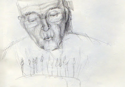
Daily Sketch 10: Blowing out candles

Original Image.

Analysis: This posed an unusual challenge, in that the main source of light is technically from below from the candles, but because of the camera flash, there's a double light source. This resulted in some of the areas that I expected to be dark (upper lids) actually being fairly light. Given more time, and an eraser, I could work on refining the light source. The candles and cake were thrown on the page after the timer was up for reference (he looked strange without it). Right eye is too small, lips are too small, shading where the glasses were is off, because I could mostly just see the reflections of the candles in the glasses. Fairly happy with the initial shading on his jowls, even if they may be a little skinny.

Tuesday, January 13, 2009

Daily Sketch 9: Woman with hat (hair accessory)

Original Image.

Analysis: Lips too far to the left. Maybe if this were fixed, she would look more like she was smiling instead of looking confused. Also, the lines on her face are not as harsh as the sketch shows. I think I need to try hatching in the lines, rather than being so linear with them.

Monday, January 12, 2009

Daily Sketch 8: Grimace

Original Image.

Analysis: This is NOT a 15 minute sketch...more like a 45 minute sketch. Overall, the face is at least twice the size of all the other faces, so more area to shade. I don't like the pout, and I did a really bad job on the eyes. They're not even close to the same size. I always seem to have more trouble with the half closed eyes, because they're deceptively long. I am really happy with the shading on the neck, because it lays in a solid area of grays that somehow has its own unintentional shading, and it was really fast. It also quickly distinguises between areas of light and shadow. I need to do this more initially before getting to form-following shading.

Sunday, January 11, 2009

Daily Sketch 7: Astonished

Original Image.

Analysis: I think my biggest complaint is the nose. The perspective is not as good as I would like. It's a delicate nose, angled up and the only truly dark areas are the nostrils, which both angle up and slightly left. The nose I drew is shown too much from the front. I think her features are also a bit small for the size of the face I drew. I didn't really lay out all the angles that the facial features lay on, and I should have. Also she's supposed to be looking up rather than slightly to the side.

Friday, January 09, 2009

Daily Sketch 6: Baby kissing mirror

Original Image.

Analysis: There were two slight shifts in my sketching technique today that I'm going to try to incorporate in all further sketches. First, I noticed I'd been using a lot of short, stiff strokes to lay out the basic form. Second, I was randomly laying in shading all over the form, resulting in minimal shading over a large area. After watching a video of another illustrator sketching using very fluid, quick, loose strokes to lay in the form, he then went back and shaded only the focal point, leaving the rest of the sketch very loose. Over all, I think that is the best option for me. The loose, let-the-pencil-flow from the center out is something I learned in drawing class and I'm already pretty good at doing...if the subject is a child, like the one here. Children are all round with dynamic poses and I like their proportions better then adults. I think this sketch was fairly successful, although it looks more like she's kissing an older sibling with a flat nose then her own reflection. Also if you tilt my image slightly to the left (or your head to the right) the position of the head relative to the body is more accurate.

Thursday, January 08, 2009

Daily Sketch 5: Hand holding flower

Original Image.

Analysis: As my first hand, I picked a fairly difficult one. It has a LOT of character but it is a relatively flat palm; not the most dynamic of hand shapes. Even still, I should have flowed the pencil across the page more, feeling out the overall shape and rhythm. I particularly like the graceful curve of the palm/first finger and the v it makes with the thumb. I erased and redrew the fingers just like I erased and redrew last night. I don't know if that made it better or worse. My proportions are a little wonky and the image is stiff. Need more practice.

Wednesday, January 07, 2009

Daily Sketch 4: Asian Profile

Original Image.

Analysis: Just. Plain. Bad.

So much so, in fact, that I chose to repeat the exercise and try again. The first image was going well until I thought that the chin was too long. Instead of doing the intelligent thing and fixing the chin, I chose to erase the completely drawn out ear and push the ear back. Wrong idea. After doing so, I had no drawn ear, no more neck, and the chin was STILL too long for the face. Overall, the face was too flat.

Attempt 2: Much better, even if I never did get to draw any hair. She actually looks like a decent looking human now rather than a badly proportioned alien masquerading as a human. I think the corner of the lips should be further left, and I only got to lay in rough shading. I will have to draw more asian faces. They have such subtle shapes that it really is a lot about shading (once you lay in the correct form, of course)

Tuesday, January 06, 2009

Daily Sketch 3: Man in hat

Original image.

Analysis: This guy was a fun face to draw, he had character. I got to shade some today, and I actually got a little bit of the beard in this time! I think it's because his face is not my 'standard shaped face' that I always end up drawing without a photo reference. I think my drawing of him is also happier than the original image. Areas that need work: right side of face...the cheek is too concave, and the jaw juts out slightly to the right. Also the shading under the chin was laid in to harshly at first and I couldn't refine as well as I would have liked to. Need to get all the cast shadows darker, but particularly the ones under the brim of the hat, since that is practically the focal point of the image. Another random thing is that i don't like the shading on the background...should have shaded it out more or let it fade on the outer edge.

Monday, January 05, 2009

Daily Sketch 2: Glasses


Original image.


Analysis:

Spent more time working on the tangents today...so much so that I didn't even start shading! Really, i started being too picky with the shape of the mouth and the nose (and yet the mouth still needs to shift right more. I also think that i'm making the edge 'curves' too deep, they're very soft and subtle in the picture. The eyes are also a bit off. I didn't fully get the sassy glance down, either. Did have fun with the messy hair, though.

The purple coloring was done after the timer to just lay in the hand briefly, and make adjustments I felt were needed.

Sunday, January 04, 2009

Man with big nose

Original image.

Analysis:
Not bad for my first sketch. I need a sharper pencil (or to have my pencil sharpener handy. Totally missed the mustache, and the whole mouth/jaw area needs more detailing/wrinkles. He looks like he got a face lift in my sketch. Ear is too small, too high, and too close to other facial features. I need to work on placement of features by adding my tangents in more before I start shading. Overall, pretty happy with the nose and eye although the bridge should be slightly wider.

New Year's Resolution

Even though it is not New Year's eve/day, there's still time to make a resolution. I've been thinking about it and I decided that I wasn't going to make a whole list of fancy resolutions that would attempt for a few days/weeks and then the resolution dribbles away into nothing.

I only have one true resolution that I would really like to do: work on more artwork. I've seen many cases of an ok artist developing amazing drawing skills just by constantly drawing. Case in point: Megatokyo. Look at the artwork of Fred Gallagher's first volume and look at his skill now. Even he admits he wasn't the greatist at figure drawing when he started. With my own art, I have definitely seen a marked change in my skill level when I started college to what I work on today. However with my full-time job as a graphic designer, I have let my skills dribble down to the occasional illustration (maybe one every 3-4 months) and I rarely sketch anymore. And sketching is where you come up with some of the best ideas sometimes. Also, I continually laud the fact that I can't draw hands and faces as well as I should.

That being said, my resolution is to spend 15 minutes (timed) a day on a random sketch of hands or faces and post each sketch to my blog. To encourage that I stick with the project, if I fail to post for 3 days in a row (except in times when we're traveling for vacation) we will cancel our cable. So look forward to the sketches, and I will be looking forward to seeing the progression of my skill over a year's time.

Saturday, April 26, 2008

Me sketching...me


Hey look! Wasn't I a cute kid?! I've been looking for free sources of reference photos for my illustration work, ie., photos that myself, my family or my friend took and don't mind if I use for reference, and I thought what better to use then photos of myself. I've always liked this image of me climbing the fence, and I had fun drawing it freehand, particularly with the fence.

Sketched in a moleskin, the one sketchbook I seem to adore, especially the purse-sized version.

Second vector illustration


This is my second trial illustration using Illustrator. The reference photo is of my niece, Bella, although I primarily used her face/upper shoulders for the reference. Oh, and the outfit, because she always has really cute outfits on. The only thing I'm not fully happy with is the kneecap, but since this is digital, and I work on layers, this is infinitely editable and I can fiddle and fuss till my perfectionist heart is content. Yay me :) If I wanted to be particular, her eyes have no color and her hair has no shading, but I still like it a lot, as is.

I did this for a sample for a possible illustration job that I'm hoping to get. More news on that if I get the job.

Belated finished sketch...


It's been over 2 weeks since I finished the quick little samples of the young girl sketch that I posted last time. I should have posted them long since, but here they are now. I did a total of 4 in one night, which is quite different then my usual pace. 3 were traditional ink and watercolor (with a little color pencil thrown in) and the one with the solid green background is digital using illustrator (vector illustration, woohoo!). My favorite freehand one didn't get saved correctly, and I am not going to scan it again now. I am not 100% satisfied with the dress folds where her leg is coming forward. I liked the folds in the sketch better, but you could also SEE her legs in the sketch. I want to start taking drawing classes again, particularly classes that focus on a) heads, hands, and feet; b) fabric folds and drapery; and c) animation classes that focus on expression. I think that will help my illustrations out a lot in the long run.

Tuesday, March 25, 2008

Sketch in progress...


I'm working on samples of my illustrations using both traditional and digital media. I will be working on the same set of illustrations in both media. Tonight I worked on the digital version of one of my sketches from last year that I really like. This is the illustrator traced version of the image. I will be trying out both blocking in color with illustrator and using photoshop to "brush" in color behind the "ink" lines. I will also be using both a pen and a quill in my traditional ink and watercolor samples.

Thursday, March 06, 2008

Achoo! complete

Tonight was a very productive night, as I finished the last little bit on my illustration for the CSUN illustration club student show Affliction, which opens tomorrow night. It is called Achoo! and it is very cute. I did it in a very rough format, working rapidly (for me, if not for the rest of the art world). I don't like the blending quite as much as the other pieces, but I really like the color and contrast in this piece: very rich, vivid color (for all it being a muted palette) and better contrast than my work normally has. I will consider doing more pieces like this as I finish in about 1/3 the time. But I will not make any decisions without trying more techniques out on my demo board. Even then i'll probably continue to experiment and grow and develop even newer techniques. Hopefully by that stage i'll have also purchased a Cintiq and Painter and will be working on digital art as well as traditional.

In addition to finishing up an illustration, I have done a quick sketch/color comp of the next piece I'm working on: a knight charging a monster, as seen from the knight's viewpoint. I think the end piece will be wider then what I sketched out, and I'm not so fond of the monster at the moment, since i am not very good at scary looking monsters (CUTE monsters, no problem) but I like it so far. I think it is more dynamic then what I usually do, and I can even push the final drawing a bit more then what I have so far.

All in all, the only disappointing news I have tonight is that I won't get an image of Achoo! on the website until a week from now when the show comes down and (hopefully) my scanner is installed on my computer once again.

Monday, January 28, 2008

Post or else...

I apparently HAVE to post, because I haven't posted in nearly a year. I guess time flies when you're busy....A new job, a NEW new job...a new nephew when we were expecting a new niece...I guess life happens. :)

Two new pieces of art currently ongoing...a dragon for Jan, almost done...if I can ever figure out what to put behind him. And a CUTE (really serious here) entry for the disease/sickness/affliction themed illustration gallery show at CSUN in March. When Scott saw it and I told him the story behind it, all he had to say was I was "...seriously well adjusted..." You'll get the full story when I post the art. And one day, Scott WILL actually get artwork created for him by me...sorry Scott, I must be too well adjusted for the first 5 or so tries on your artwork.

I'll post more later when it's not past my bedtime.

Thursday, January 24, 2008

Site temporarily down

This is Deathshade posting for Nightengail, I took our home web server down to repurpose the hardware. I'll try to bring her site up again soon.

Wednesday, August 15, 2007

Yay! Four new images on the website

There are now 4 new images on the website: 3 colored pencil illustrations and one watercolor piece. The watercolor piece is one from last year that finally got scanned. I found someone in Glendale who does large-format scanning with about what I expected for prices. (I would always like less expensive, but it is still decent pricing)

The first colored pencil illustration is my namesake and one of my oldest acceptable drawings redone in my new style. It is a mechanical nightingale based on the oriental fairy tale "The Nightingale." I really didn't like any of the other illustrations I did for that project, but I always loved the mechanical bird. I decided to wait until my skill level caught up with what I wanted the bird to look like. I might work on one of the more dynamic poses I had for the bird at a later date, but for now I'm pleased with the one that I did.

The last two drawings are for an online baby store that will be opening up soon: www.notyouraveragebabyshop.com. I had a lot of fun working on these illustrations, and working with the owner of the online store. The site is not live yet, but there is a nice placeholder page with a vaguely familiar image on it.... :)

I have a number of sketches that i'll be turning into illustrations at some later date, but I have two projects that I plan on working on next...I better get to them!


Powered by ScribeFire.