
Technically, I did a daily sketch last night. However, it is not being posted because both Eric and I concur that the sketch of the cute little baby ended up creeeeeeepy. Why can't I draw cute babies. I like babies, I like cute things. I don't understand it.
Also, the daily sketches will be on a pre-scheduled one-week hiatus and will return next week...hopefully with cute drawings and not creepy ones.
Wednesday, February 04, 2009
Sunday, February 01, 2009
Daily sketch 18: male, newborn

Original image.
Analysis: This month I begin the first of a 2-month long theme: The human form at every age. This month I am working on drawing males, starting with this newborn. He's just so cute all bundled up in the towel basket--not that you can see the basket in the sketch. I did borrow a technique from the Tatty Teddy to make the towels look all fuzzy without any shading.
Temporary web gallery up
Web Gallery.
Since my blog is my website at the moment, we decided that I needed to get my gallery up. It's good to get my work out into the world. Maybe it will encourage me to work faster. :)
Enjoy
Since my blog is my website at the moment, we decided that I needed to get my gallery up. It's good to get my work out into the world. Maybe it will encourage me to work faster. :)
Enjoy
Friday, January 30, 2009
Illustration Friday: flawed
 Illustration Friday.
Theme: Flawed. This is actually my second sketch today...wasn't liking the first one. These were originally going to be plant creatures, one with a missing petal, but they ended up armless-bird/cat/Dr. Suessian creatures of an unknown and slightly confused sort. One has a slight problem...
I've been wanting to do an illustration friday for a while and keep forgetting. I remembered today! yay! Hopefully more to come.
Tuesday, January 27, 2009
Daily Sketch 17: Hands? ...nope, paws

Original Image.
Analysis: The theme was paws today...I just chose an image that had a bit MORE than paws in it. I like the motion/movement to the sketch and the original image. I had fun with the sketch, and working with interesting shapes (sometimes, i feel like i'm drawing the same face again and again with portraits). I didn't like how the cub's face came out, and i think i messed up with the eyes. I love how the mother's face turned out, even with a crooked nose. We'll also ignore that my vertical line denoting the edge of the picture is anything but vertical.
Sunday, January 25, 2009
Daily Sketch 16: Hands on table

Original Image.
Analysis: Hands still suck. I actually don't think I did horrible, except for the fingers (not thumb) of the back hand. They are too small. Because the hands are so complex to draw, shading is minimal. I hope as i get better I learn to shade more in 15 minutes.
Friday, January 23, 2009
Daily Sketch 15: Woman w/ hat II
 Original Image.
Analysis: I loved the shadow shapes in this photo, and it's the first one where the majority of the face is dark. VERY dark. The eyes are slightly off, the upper left side of the face needs to be darker, and the lips and face slightly wider. The lips look fuller then I actually drew them, but that was a result of when I was laying in the shading. The fun part is that I did use my electric eraser when i was done to pick out the highlights in the white of the eye and the chin strap.
Wednesday, January 21, 2009
Daily Sketch 14: Looped fingers
 Original image.
Analysis: A friend informed me that I was being lax in drawing hands, so thus we have hands! Perspective on fingers sucks. Plain and simple. I did a decent job on the last three digits of each hand, but lets not get started on the thumbs and forefingers. Bad perspective, bad scale (itty-bitty thumb, large forefinger). Overall, I like the linework in this sketch more then the actual drawing. More hands needed.
Monday, January 19, 2009
Daily Sketch 13: Woman looking up
 Original image.
Analysis: I think I know where I'm going wrong; I think I draw the lips way too small for the shape they actually are. I drew out my nice framework with a solid parallelogram from the cheek bones to the chin with just a slight curve at the bottom, and still, the eyes ended up in the middle of the cheek bone line rather than above, as they were supposed to be. Thus her face is shorter and fatter then it is supposed to be. Even still, I redrew the nose 3 times and the eyes 2.5 times and overworked the neckline. I know where the shading is supposed to go once the features are in place...i just need to properly size/align everything now. No wonder some people can spend a lifetime learning to draw the human form.
Sunday, January 18, 2009
Daily Sketch 12: Mustache
 Original Image.
The original theme for today was Conquistador, but all the images i could find were drawn or painted, so I went with what any good conquistador would have: a mighty fine mustache.
What's cooler than a guy with a black bowtie, black bowler hat, and a 6-part curly mustache?
Analysis: Obviously I had fun with this more-like-30-minute 15 minute sketch. For some reason each time I become fixated on working on the nose first, and I think I start working to fast, leaving me no room to correct. I think this nose should have been wider and maybe a smidgen shorter. And for some reason glasses always hang me up on the shading of the face. I didn't quite get in the laugh lines as well as I wanted.
Saturday, January 17, 2009
Daily Sketch 11: Yawn
 Original Image.
Analysis: This sketch was a lot of fun. I think I really spent 30-40 minutes on this 15 minute sketch, because I wanted just a little bit more detail. The wrinkles on the nose and eye lids are so delicate to draw/shade, I needed to work with them a bit more to feel satisfied. His nose looks just slightly angled to the left, and the cheeks are a little thin compared to the size of his facial features, but that would be an easy fix. My favorite part is the brow line and forehead on the left. I'd like to get that level of spontaneity and rendering/shading throughout my entire sketch at some point. Sometimes I overwork things too much.
Thursday, January 15, 2009
Daily Sketch??

This is a test of the gotta-work-on-something else broadcast system. Your regularly scheduled daily sketch will return tomorrow. Please tune in then. (we apologize for the inconvenience)
Oh, and if you magically know how to turn fire and water into palm trees, please give me a call! (confused? so am i.)
Wednesday, January 14, 2009
Daily Sketch 10: Blowing out candles
 Original Image.
Analysis: This posed an unusual challenge, in that the main source of light is technically from below from the candles, but because of the camera flash, there's a double light source. This resulted in some of the areas that I expected to be dark (upper lids) actually being fairly light. Given more time, and an eraser, I could work on refining the light source. The candles and cake were thrown on the page after the timer was up for reference (he looked strange without it). Right eye is too small, lips are too small, shading where the glasses were is off, because I could mostly just see the reflections of the candles in the glasses. Fairly happy with the initial shading on his jowls, even if they may be a little skinny.
Tuesday, January 13, 2009
Daily Sketch 9: Woman with hat (hair accessory)
 Original Image.
Analysis: Lips too far to the left. Maybe if this were fixed, she would look more like she was smiling instead of looking confused. Also, the lines on her face are not as harsh as the sketch shows. I think I need to try hatching in the lines, rather than being so linear with them.
Monday, January 12, 2009
Daily Sketch 8: Grimace
 Original Image.
Analysis: This is NOT a 15 minute sketch...more like a 45 minute sketch. Overall, the face is at least twice the size of all the other faces, so more area to shade. I don't like the pout, and I did a really bad job on the eyes. They're not even close to the same size. I always seem to have more trouble with the half closed eyes, because they're deceptively long. I am really happy with the shading on the neck, because it lays in a solid area of grays that somehow has its own unintentional shading, and it was really fast. It also quickly distinguises between areas of light and shadow. I need to do this more initially before getting to form-following shading.
Sunday, January 11, 2009
Daily Sketch 7: Astonished
 Original Image.
Analysis: I think my biggest complaint is the nose. The perspective is not as good as I would like. It's a delicate nose, angled up and the only truly dark areas are the nostrils, which both angle up and slightly left. The nose I drew is shown too much from the front. I think her features are also a bit small for the size of the face I drew. I didn't really lay out all the angles that the facial features lay on, and I should have. Also she's supposed to be looking up rather than slightly to the side.
Friday, January 09, 2009
Daily Sketch 6: Baby kissing mirror
 Original Image.
Analysis: There were two slight shifts in my sketching technique today that I'm going to try to incorporate in all further sketches. First, I noticed I'd been using a lot of short, stiff strokes to lay out the basic form. Second, I was randomly laying in shading all over the form, resulting in minimal shading over a large area. After watching a video of another illustrator sketching using very fluid, quick, loose strokes to lay in the form, he then went back and shaded only the focal point, leaving the rest of the sketch very loose. Over all, I think that is the best option for me. The loose, let-the-pencil-flow from the center out is something I learned in drawing class and I'm already pretty good at doing...if the subject is a child, like the one here. Children are all round with dynamic poses and I like their proportions better then adults. I think this sketch was fairly successful, although it looks more like she's kissing an older sibling with a flat nose then her own reflection. Also if you tilt my image slightly to the left (or your head to the right) the position of the head relative to the body is more accurate.
Thursday, January 08, 2009
Daily Sketch 5: Hand holding flower
 Original Image.
Analysis: As my first hand, I picked a fairly difficult one. It has a LOT of character but it is a relatively flat palm; not the most dynamic of hand shapes. Even still, I should have flowed the pencil across the page more, feeling out the overall shape and rhythm. I particularly like the graceful curve of the palm/first finger and the v it makes with the thumb. I erased and redrew the fingers just like I erased and redrew last night. I don't know if that made it better or worse. My proportions are a little wonky and the image is stiff. Need more practice.
Wednesday, January 07, 2009
Daily Sketch 4: Asian Profile

 Original Image.
Analysis: Just. Plain. Bad.
So much so, in fact, that I chose to repeat the exercise and try again. The first image was going well until I thought that the chin was too long. Instead of doing the intelligent thing and fixing the chin, I chose to erase the completely drawn out ear and push the ear back. Wrong idea. After doing so, I had no drawn ear, no more neck, and the chin was STILL too long for the face. Overall, the face was too flat.
Attempt 2: Much better, even if I never did get to draw any hair. She actually looks like a decent looking human now rather than a badly proportioned alien masquerading as a human. I think the corner of the lips should be further left, and I only got to lay in rough shading. I will have to draw more asian faces. They have such subtle shapes that it really is a lot about shading (once you lay in the correct form, of course)
Tuesday, January 06, 2009
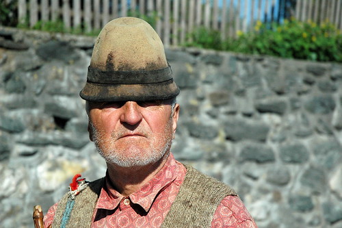
Daily Sketch 3: Man in hat
 Original image.
Analysis: This guy was a fun face to draw, he had character. I got to shade some today, and I actually got a little bit of the beard in this time! I think it's because his face is not my 'standard shaped face' that I always end up drawing without a photo reference. I think my drawing of him is also happier than the original image. Areas that need work: right side of face...the cheek is too concave, and the jaw juts out slightly to the right. Also the shading under the chin was laid in to harshly at first and I couldn't refine as well as I would have liked to. Need to get all the cast shadows darker, but particularly the ones under the brim of the hat, since that is practically the focal point of the image. Another random thing is that i don't like the shading on the background...should have shaded it out more or let it fade on the outer edge.
Subscribe to:
Posts (Atom)


