Original Image.
Analysis: This sketch was a lot of fun. I think I really spent 30-40 minutes on this 15 minute sketch, because I wanted just a little bit more detail. The wrinkles on the nose and eye lids are so delicate to draw/shade, I needed to work with them a bit more to feel satisfied. His nose looks just slightly angled to the left, and the cheeks are a little thin compared to the size of his facial features, but that would be an easy fix. My favorite part is the brow line and forehead on the left. I'd like to get that level of spontaneity and rendering/shading throughout my entire sketch at some point. Sometimes I overwork things too much.
Saturday, January 17, 2009
Thursday, January 15, 2009
Daily Sketch??
This is a test of the gotta-work-on-something else broadcast system. Your regularly scheduled daily sketch will return tomorrow. Please tune in then. (we apologize for the inconvenience)
Oh, and if you magically know how to turn fire and water into palm trees, please give me a call! (confused? so am i.)
Wednesday, January 14, 2009
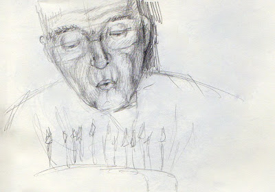
Daily Sketch 10: Blowing out candles
Original Image.
Analysis: This posed an unusual challenge, in that the main source of light is technically from below from the candles, but because of the camera flash, there's a double light source. This resulted in some of the areas that I expected to be dark (upper lids) actually being fairly light. Given more time, and an eraser, I could work on refining the light source. The candles and cake were thrown on the page after the timer was up for reference (he looked strange without it). Right eye is too small, lips are too small, shading where the glasses were is off, because I could mostly just see the reflections of the candles in the glasses. Fairly happy with the initial shading on his jowls, even if they may be a little skinny.
Tuesday, January 13, 2009
Daily Sketch 9: Woman with hat (hair accessory)
Original Image.
Analysis: Lips too far to the left. Maybe if this were fixed, she would look more like she was smiling instead of looking confused. Also, the lines on her face are not as harsh as the sketch shows. I think I need to try hatching in the lines, rather than being so linear with them.
Monday, January 12, 2009
Daily Sketch 8: Grimace
Original Image.
Analysis: This is NOT a 15 minute sketch...more like a 45 minute sketch. Overall, the face is at least twice the size of all the other faces, so more area to shade. I don't like the pout, and I did a really bad job on the eyes. They're not even close to the same size. I always seem to have more trouble with the half closed eyes, because they're deceptively long. I am really happy with the shading on the neck, because it lays in a solid area of grays that somehow has its own unintentional shading, and it was really fast. It also quickly distinguises between areas of light and shadow. I need to do this more initially before getting to form-following shading.
Sunday, January 11, 2009
Daily Sketch 7: Astonished
Original Image.
Analysis: I think my biggest complaint is the nose. The perspective is not as good as I would like. It's a delicate nose, angled up and the only truly dark areas are the nostrils, which both angle up and slightly left. The nose I drew is shown too much from the front. I think her features are also a bit small for the size of the face I drew. I didn't really lay out all the angles that the facial features lay on, and I should have. Also she's supposed to be looking up rather than slightly to the side.
Subscribe to:
Posts (Atom)